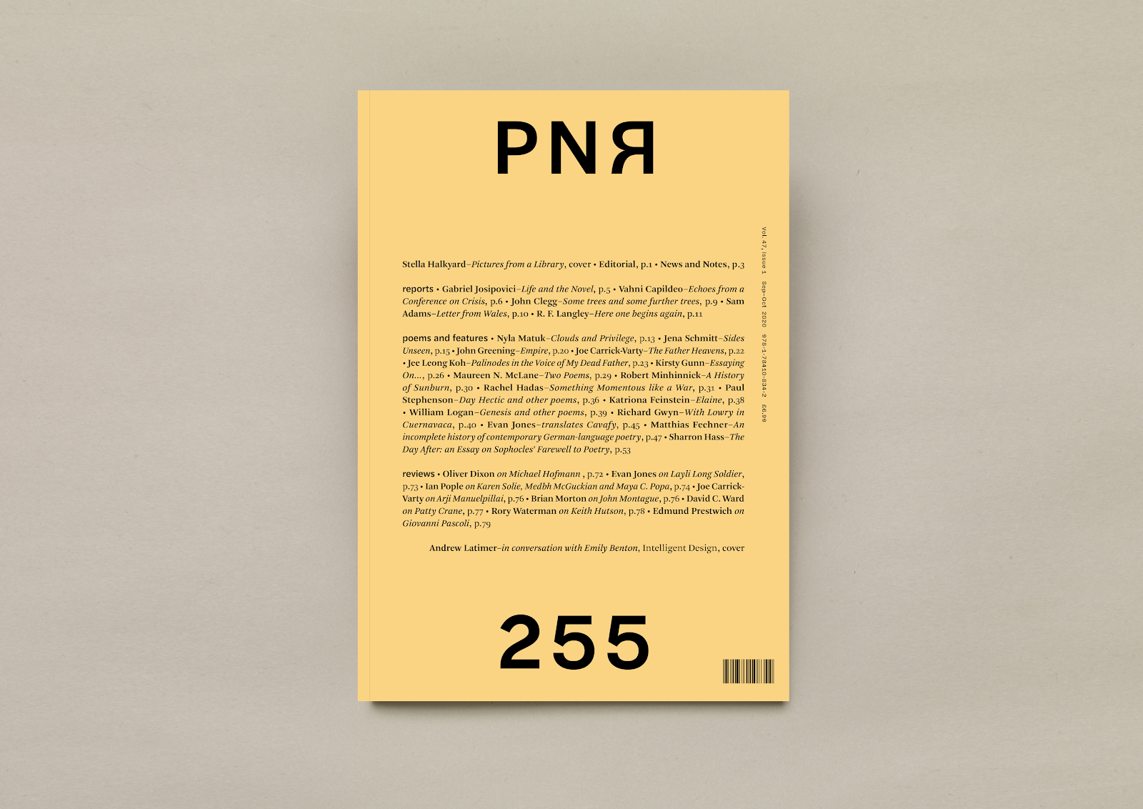
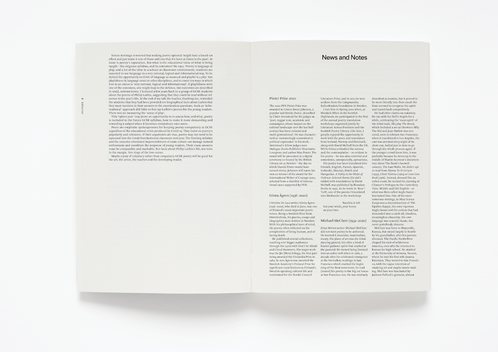
Emily Benton Instagram
Connecting with Emily Benton: Typefaces and Paper are My Playgrounds
Emily Benton is a book designer who studied Graphic Design and Book Design before embarking on a career in London. Following several years of working for respected graphic design studios, she set up her successful freelance business.
What background is required to be a book designer? How did you first get into it?
I graduated with a BA in Graphic Design but felt somewhat disheartened at the prospect of heading into a career in marketing and advertising. That path wasn’t for me; I knew that.
It took me several years to discover that book design was even a thing, let alone that I wanted to do it. But once the seed had been planted (a chance meeting with an editor/friend who mentioned it), I was totally obsessed. It felt utterly right.
I did an MA in Book Design at Reading, which is well regarded in typographic circles. I made some great contacts there, including John Morgan (studio) and Fraser Muggeridge, who are both well established and much respected in arts and culture publishing.
I went on to work for John and another artist/publisher, Arnauld Desjardin, at The Everyday Press in London for a number of years. I built up the experience and worked on some big projects (Antony Gormley, Helen Marten), before leaving both, and London, and setting up on my own in Edinburgh!
It sounds so simple when you write it down, but like with any creative practice, there’s a large amount of exploration. The path ahead isn’t always as clearly defined as the path you’ve come through.


What is your primary focus/aim in making the product? Is it visual, narrative or tactile (paper, textures)?
All three, in fact, are completely inseparable for me. The balance/relationship formed between the ‘intention’ and the ‘means’ is also an important factor in the book’s final outcome.
It’s pertinent that you mention narrative, actually, as this is at the core of the book as an object. It’s a linear form. A sequence is inevitable unless it’s unbound as a conceptual intention. There will be a beginning, a middle and an end, even in an image-based book.
Tactility plays a critical part in my collaborations too. I see myself as more of a typographer than a graphic designer, and my design solutions tend to err on the more text-based, visual solutions. So I call upon the tactility and material qualities of another great art form: papermaking. My studio is filled with swatch books of papers, cloth, ribbons and foils, as you can imagine.
Another fascinating tool in any designer’s arsenal is a type library. The choice of typeface (and its placement on the page) has an instantaneous yet quite a subliminal effect on the reader. For instance, in a book about south polar expiration, I descended the text for each chapter opener further down than the previous opener, creating a subtle feeling of travel.
There are a world of options out there. Typefaces and paper are my playground.

How do you start your work with a client? Does inspiration come from the body of work and their specifications, or do you brainstorm and present options?
The jumping-off point for a project will depend on the subject matter and the people involved. However, it’s my preference to begin with a call or meeting, to enjoy a real conversation and to get to know the feel of the work and the impetus behind wanting to translate the work into book form. This is slightly more straightforward with literary works, as the book form feels like its natural home, but I wouldn’t want to take that for granted by not exploring the possibilities. It might be that the content would be better suited to being published digitally, or as a series of cards, perhaps. The book or codex (two pages bound on one side) is just one way to ‘make public.’
But yes! You’re absolutely right; inspiration does often come from the work. The artist/author and I will brainstorm together. I listen and present immediate feelings or a sense of something and intuit their reaction. My ideas can spark something in them, something they may not have considered before, and vice versa. It’s a really exciting part of the project. It’s like a treasure hunt. I’ve been given the clues. Now I must find the material/typographical pieces.
Has someone ever approached you with a project that you’ve turned down, because it wasn’t for you?
If someone came to me and asked for something that sounded like it would need a lot of graphic design, I would probably say I wasn’t the best person for the job. I see graphic design as shapes and symbols, graphic representations of things, and it’s not really my style. I definitely have a style: it’s minimal, it’s tactile, it’s quite spare.
Have you made any books for artists/about artists? If so, how did that process differ?
Whilst working at John Morgan studio, I had the pleasure of working closely with Helen Marten on Parrot Problems. It was the catalogue for the exhibition for which she was nominated for the Turner Prize.
More so than authors, artists tend to be more aware of the book form (sometimes as a vehicle for expression in itself) and so can be more open to the experimental, in terms of materials and production methods.
As such, John proposed a non-conventional substrate for the cover; a nylon reinforced bitumen paper. This is an industrial material found more often in construction than in bookbinding. It was quite a challenge to match the standards of the two industries with their differing ideas of material consistency! It also tested the printers because it’s an oil-based product and the nylon can have a blunting effect on their guillotine blades. John also suggested an alternate use for the traditional head and tail bands, normally seen on the ends of the spine. John’s idea (embraced by Helen) was to use this material element but to position it non-traditionally; along the foot of the inside cover. Importantly, these ideas were really suited to Helen’s work. It’s working with people like John and Helen that reinforce the idea that invention is still possible, even within an art form as historical as book making.
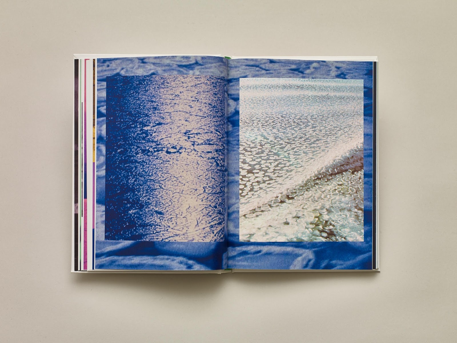
In books with a lot of images, it’s a balance between what’s appropriate for the text and what’s appropriate for the images (in terms of paper stock). Images are seen at their best when they’re on bright white-coated paper because the ink doesn’t sink in. On the other hand, if you print text onto coated white paper, there’s a bit of a dazzling effect, and the text becomes more difficult to read. Text is also way more comfortable to read on slightly off-white paper. So as a designer and as a publisher, you weigh up whether it’s a text-based book with images or an image-based book with text. Decide on the main focus, and if it’s equal, you have to find a way of making sure that both are getting equal treatment.
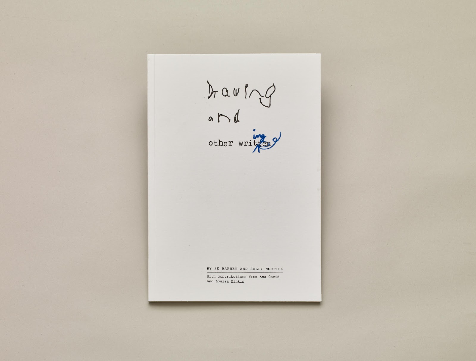
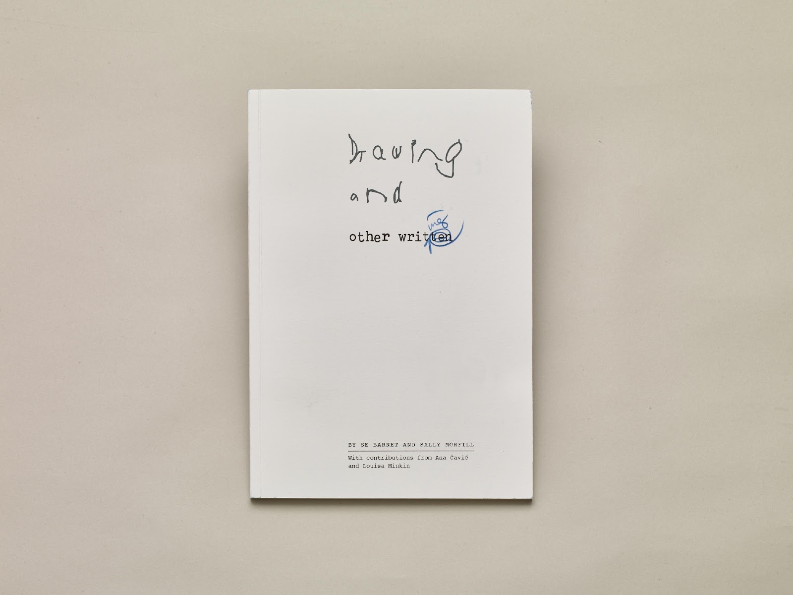
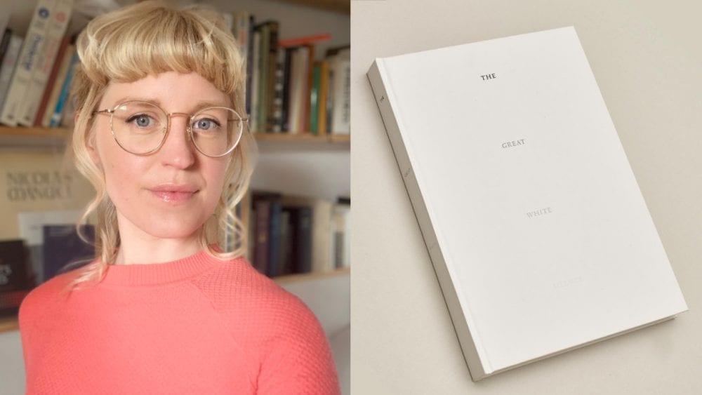
The second image above is a limited edition, hand-drawn cover.
How is creativity important in your work?
Books have been around in the codex form since the first century – that’s a pretty tried and tested method of layout. As such, there are only so many things you can do creatively with that form without it feeling gimmicky or crass. So subtlety is my creative weapon. I employ creative design and material cues that aid the reader to understand and navigate the content while being aware not to let them become a distraction. Creativity in book design is a balance between those things.
How do you feel about designing ebooks versus print books?
For a long time, I tried to stay away from ebooks. But I do think they can be really valuable for people with accessibility issues; dyslexia, or partial sightedness, for example. E-readers can be the best form of publication for people who need to be able to adapt the text to their needs. You can’t make text in a book bigger. You can only hold it closer; if it’s a big book, that’s quite hard.
So I’m happy to format ebooks, but you lose a lot of nuance of text hierarchy. The design has to go back to basics. When you open an e-reader, the typeface the designer chose is gone; the image placement becomes quite rudimentary, and it’s just very simplified. Sometimes that works, and it’s good, but sometimes it’s quite heartbreaking.


In your opinion, what makes a good book?
Something readable and ultimately fit for purpose, but also beautifully tactile and worthy of the paper it was printed upon and the resources it has used to come to fruition.


The above are two designs for the same book, but they’re for very different markets. The hardback is for private clients, the ebook can be purchased on Amazon.
When you’re designing these books, are you trying to make a visual impression on the person reading them?
No, the more that the reader notices how a book has been designed, the more it distracts from the book’s content itself.
What we’re always taught as graphic designers is to be novel and new and catch attention. Whereas a book designer or typographer actually needs to do quite the opposite because if you’re a reader, and you’re noticing an interesting way of doing a footnote marker, you’re distracted from the text. The designer has then created this barrier between the reader and the author, which is exactly the opposite of what you want to do. You actually just want to introduce them and then back away.
Creating a beautiful book is the aim, but it’s almost secondary to making a book readable. Obviously, you want people to pick up the book in the first place, so that’s where the cover comes in.
Do you have millions of books home?
I don’t, actually. David (my partner) has got more books. I think I’m pickier; I tend to have many books about books rather than books to read for pleasure. I’m too busy designing books to actually sit down and read many of them.